Selawik Font and DavidDev1

- #fonts
- 4 Aug 2020
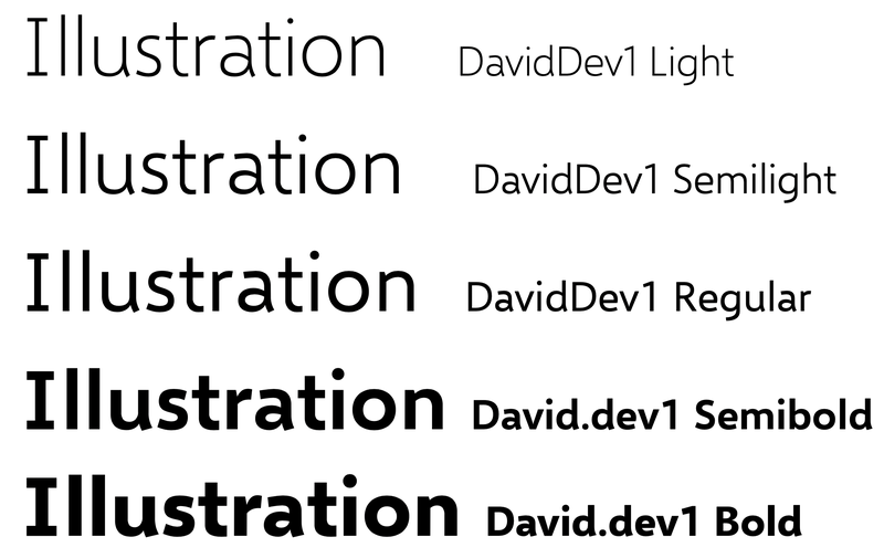
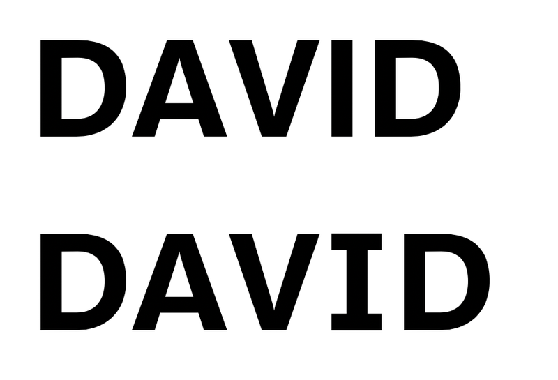
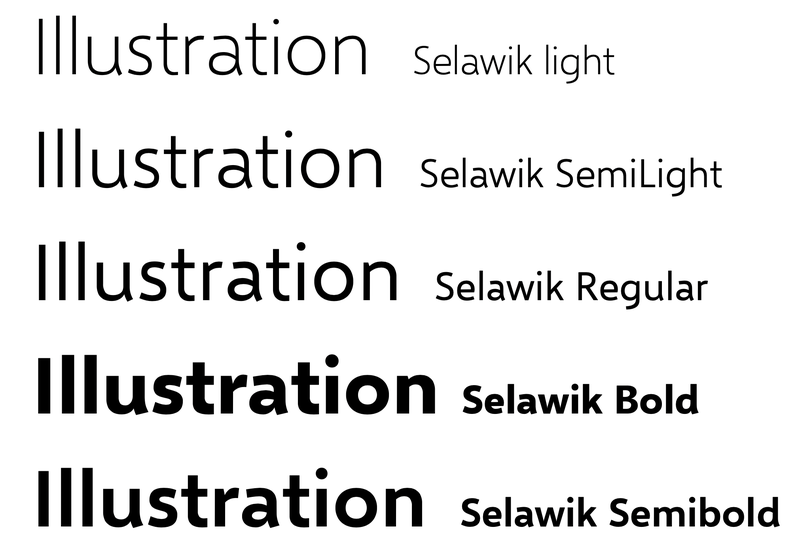
Selawik was released by Microsoft as an https://github.com/microsoft/Selawik as a replacement for the proprietary Segoe UI. This is pretty significant and unthinkable (Microsoft and open source?) just a few years ago. They even release the glyphs source file. Wow! This is not broadly advertised so a bit of a niche font. I do like the many great fonts available for free on Google fonts but I am always more intrigued by something not as widely used yet distinct. I found this font to be interesting but it also suffers for the confusing capital I that looks too similar to the lowercase l. This is what I mean:
I have already discussed this before (see