Helvetica Neue vs Neue Haas Unica vs Neue Haas Grotesk vs Aktiv Grotesk
- #fonts
- 1 Jan 2021
One of the most under-rated parts of frontend web development is typography. I have found several great developers being totally unmoved by the power of typography on the web. Things have changed: now Google fonts dominate the market because is so easy to use, convenient and free. There is however a problem with that: every font that is over used becomes boring and uninspiring.
I recently re-designed both this website and another one and I have spent several hours to compare several commercial fonts that share the same origins but are different. Helvetica was originally born as Neue Haas Grotesk. The name was not very inspiring so they went for a more catchy name that means "Swiss" in latin. (you can find the intriguing story here)
As Helvetica is installed in most computers, having the web font is almost unecessary. I have shortlisted 3 fonts that share the same spirit of Helvetica yet have some differences: Neue Haas Grotesk (supposed to be a version more truth to the original), Neue Haas Unica (another revival of a font created in the 70's that was inspired by Helvetica, Univers and Akzident Grotesk and Aktiv Grotesk from Dalton Maag. All the fonts I tested (beside Helvetica Neue) are available on Adobe fonts.
One issue I found with fonts comparisons online is that they don't show full sentences but often just the difference in an exsiting letter so here you can see the differeneces:
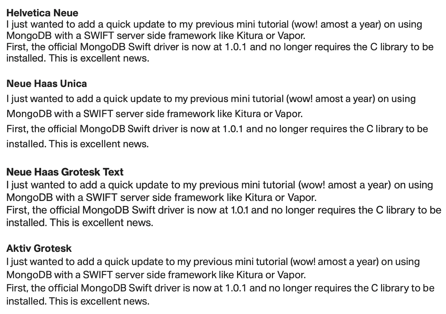
Neue Haas Grotesk and Helvetica share the most similarities but Aktiv Grotesk and Neue Haas Unica have a very distinct look. I like the spacing and moderinity of Neue Haas Unica. For this website I am using Neue Haas Grotesk text and display version but in other projects the Neue Haas Unica is also among my favourites.