Arial vs Helvetica vs Tahoma

- #fonts
- 2 Aug 2020
Today I purchased a license for the web version of the font Tahoma that is now used in this website. Born to be added in Windows 95 it fits well with the retro windows theme of this website.
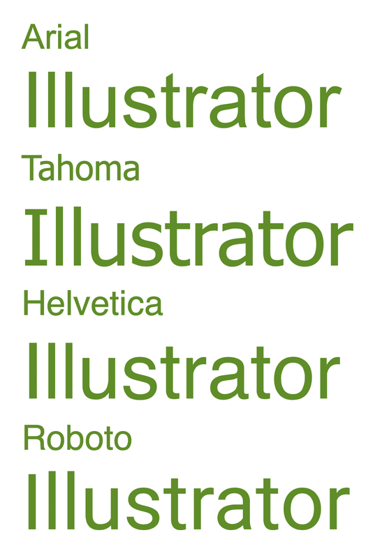
The default font that came with the CSS was Arial so why change ? Arial, Helvetica and even the Google font Roboto are plagued with a legibility issue: the capital I and l look identical. See what I mean with the word "Illustrator"
You don't have this issue with Tahoma. I didn't pay much of attention to these differences which very difficult to spot (feel free to check my iOS game fonts.yoga ) but significant in a way.
Tahoma is not entirely a web safe font: it is not available in all systems (it is on Mac OSX and Windows but not on iOS) so the license is necessary to ensure that my site will look the same on all devices.
I remember using Tahoma for some documents in the early 2000's. At that time there were no google fonts and the selection was much more limited than today. Perhaps it is a bit retro but certainly a good and legible font!